The problem
The subscription service is new. It must be easy and enjoyable to use to encourage more users to sign up.
The goal
Explore the user journey for a regular user and a Lounge Member to create a separate but seamless experience.
Help members enjoy the convenience and value of the subscription.
Project Overview
An ordering app for a coffee shop and coworking space.
Gelia Coffee Lounge is a trendy local cafe known for its cozy lounge nooks, beautiful local art murals, and a go-to spot to read books and work. As they notice a market shift during the pandemic, with more people working remotely, they are adding a coworking space subscription to their services to give these users a way to book a spot at the lounge. The target market for their coworking space subscription consists of college students, freelancers, content creators, and remote workers. While the coffee shop also provides discounted coffee for Lounge Members, it still mainly serves walk-in customers. With the additional user type, the app needs an update to manage the subscription.
Co-working space with bookable desks and meeting rooms adjacent to the coffee shop for convenient coffee runs or special delivery.
User Research
There are many types of customers who walk into the cafe but we want to focus on these 3 unique problems.
-
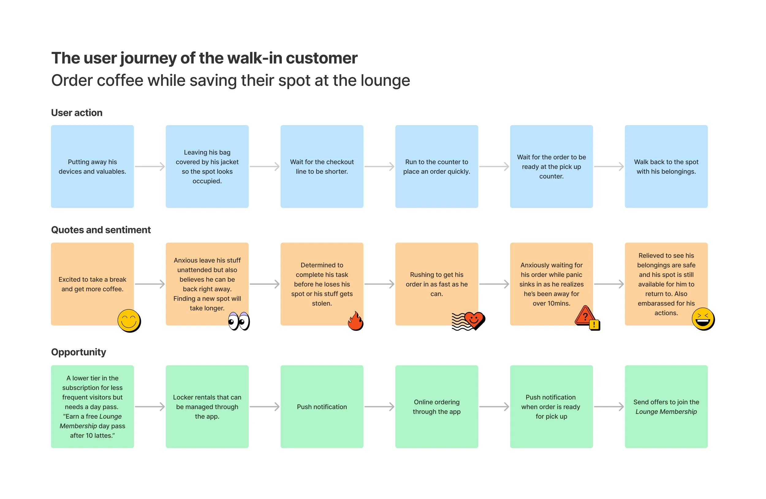
Lines are usually long at the counter. It’s difficult to find an open spot and save it if they need to go to the restroom or order more products.
-
Don’t know which spots will be open when they get there. Don’t want to delay a planned productive day by waiting in a long line with the rush hour crowd.
-
Because the line is always so long, the order pick-up counter is usually crowded, and sometimes, people grab the wrong order which delays production even more.
User pain points
Let’s discover the high-level view of these customers’ frustrations when they visit the cafe.
Brand Design
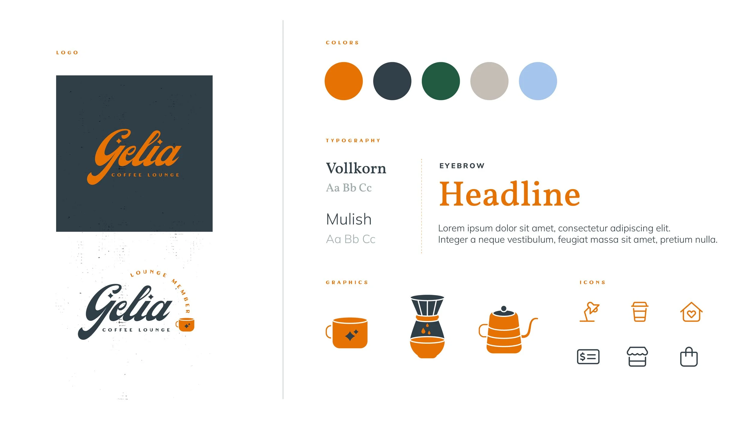
As I explored the industrial look of the lounge, there was also something warm and cozy about it. The atmospheric smell of coffee and old books is like a hug to the soul. I wanted to represent that in the brand colors. The orange is bright and energetic but also warm and grounded. The dark gray reminds you of grit and hard work as seen in residual grease on a mechanic’s overalls or on the surface of a typewriter. Green represents the beautiful greenery added to the space, light gray represents the raw cement floor and light blue from the skylights. Using the colors that were inspired by the space will hopefully help transport the users to the lounge even when they’re using the app elsewhere.
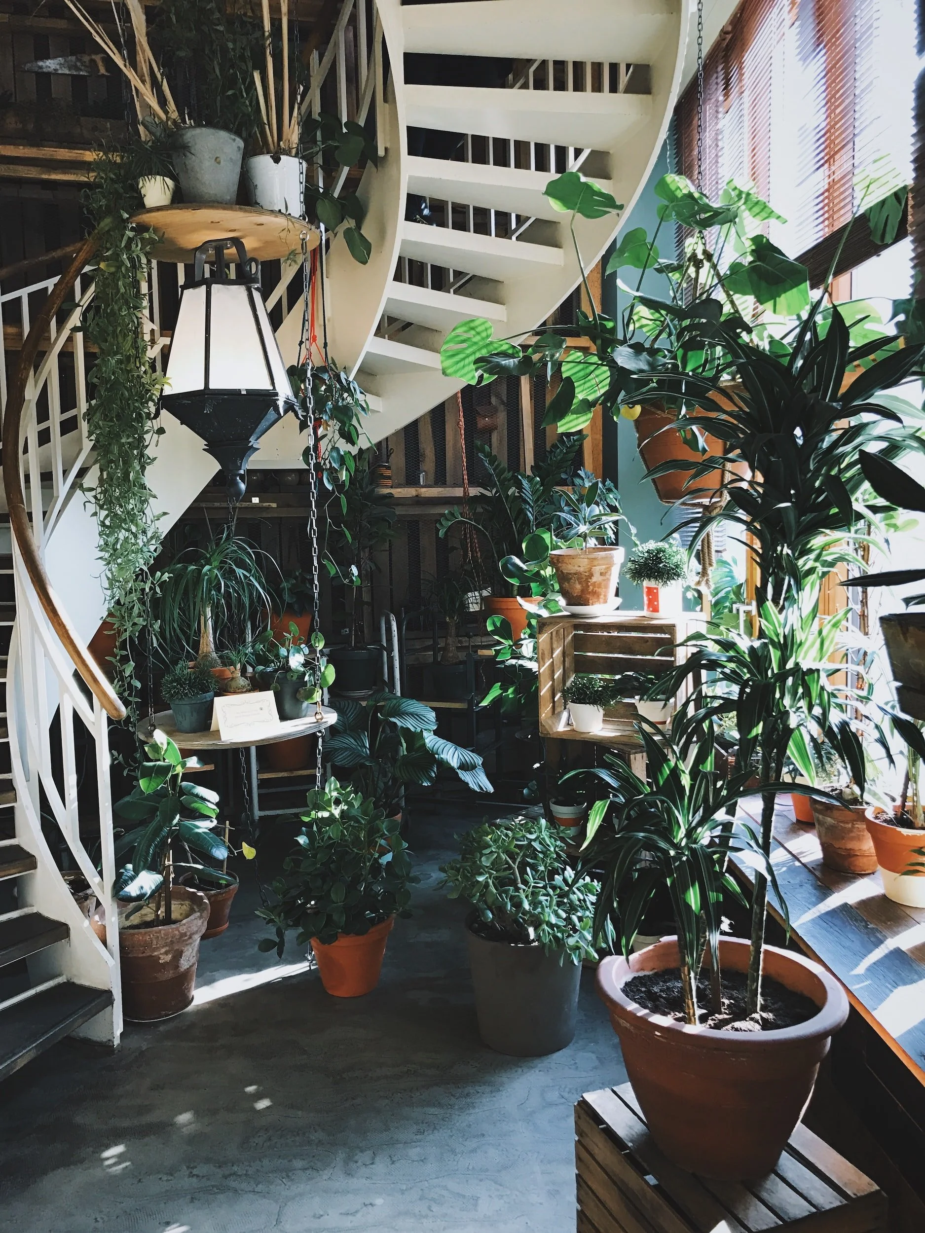
Mood: An ode to the old souls
Look and feel: Timeless, nostalgic, warm, cozy, reliable, well-crafted, gritty but sophisticated.
Feeling: The slowing down of time while enjoying the moment like getting lost in a good book. The satisfying process of doing something worthwhile like developing a film, typing on a typewriter, the meditative effects of a pour-over, bread-making, and pottery-making.
Visual Design
Ideation
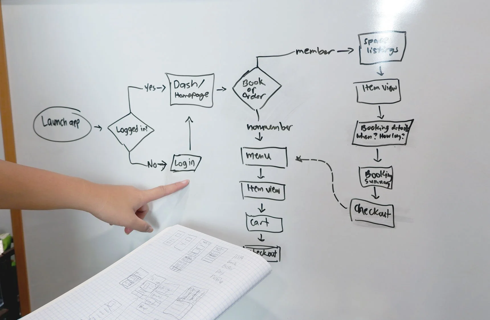
Understanding how the user navigates through the product as a member or a non-member.
User flow diagram
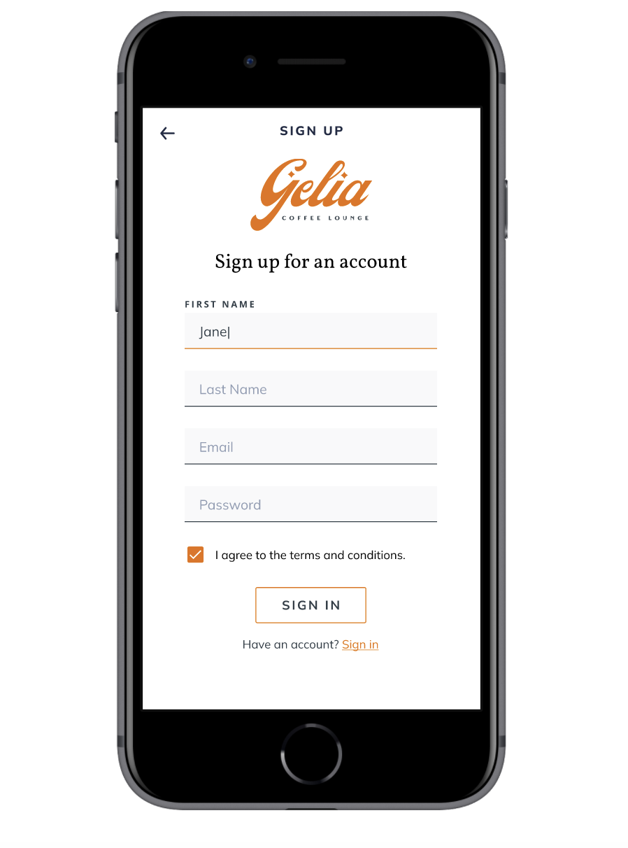
During this exercise, I found that during the Log In step, we will also add the Sign Up page for new users.
I also initially have two separate checkout experiences for space booking and coffee ordering but after running through the flow with the “dev team”, my husband (a software engineer), he told me that it would be possible to incorporate the membership points into a single checkout process and can even be converted as discounted coffee orders and free hourly rates for the space booking for the members. This will help shorten the user journey and keep them on the happy path if as they will no longer have to checkout twice.
Wire flow sketch
To refine the user flow diagram, I pressure-test it quickly with a wire flow sketch. As I design the screens, it sometimes helps me identify marketing strategy opportunities for the team like when it would make sense to offer free membership trials in their journey or suggest visiting the coffee menu right before check out.
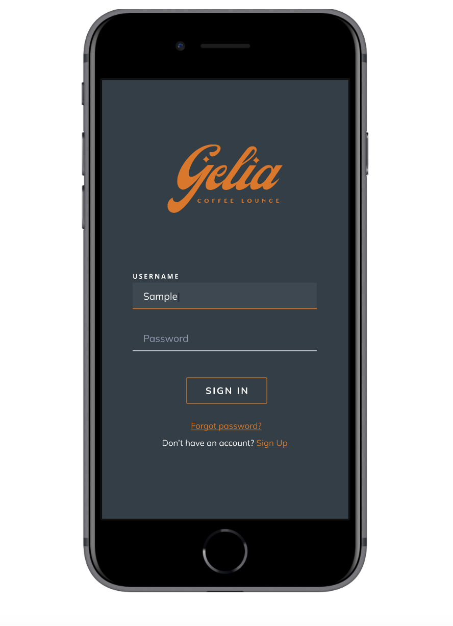
Log In Screen
Dashboard
Non-member Dashboard
Easy access to their order history and a tracker towards their next free drink. They will also get an ad to invite non-members to try the membership.
Lounge Member Dashboard
A membership badge shows at the top-right corner to indicate status. Quick view of how many cafe points or booking hours they have at the top. Easy access to their order and booking history for convenience.
Membership Screen
In-app Ordering
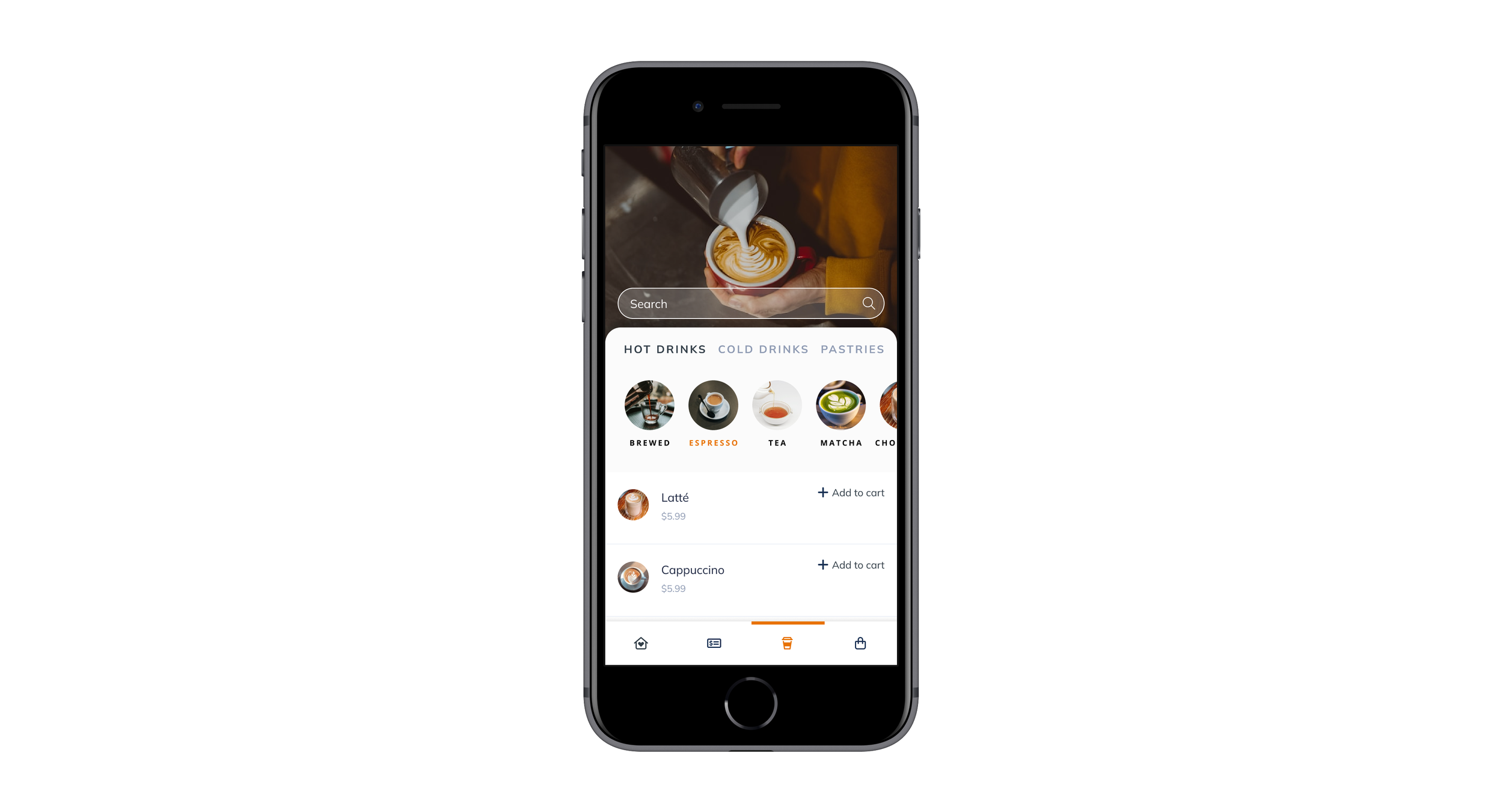
Menu View
3 main categories are at the top with sub-categories to help narrow down the decision-making. Search bar is also available if users know what they are looking for.
Item View
Ability to customize items before adding it to cart.
Health app design
This passion project is ongoing. More screens to come as I adjust my co-working space booking screens based on the information gathered as I conduct user research and prototype testing on my target audience. This was my mom’s dream business. Gelia loved to bake and feed people — a warm, cozy person. She wanted to open up a cafe where folks could lounge around while she baked for them. The mood board was inspired by her hobbies and personality.


